Okay, color spaces
https://ericportis.com/posts/2024/okay-color-spaces/
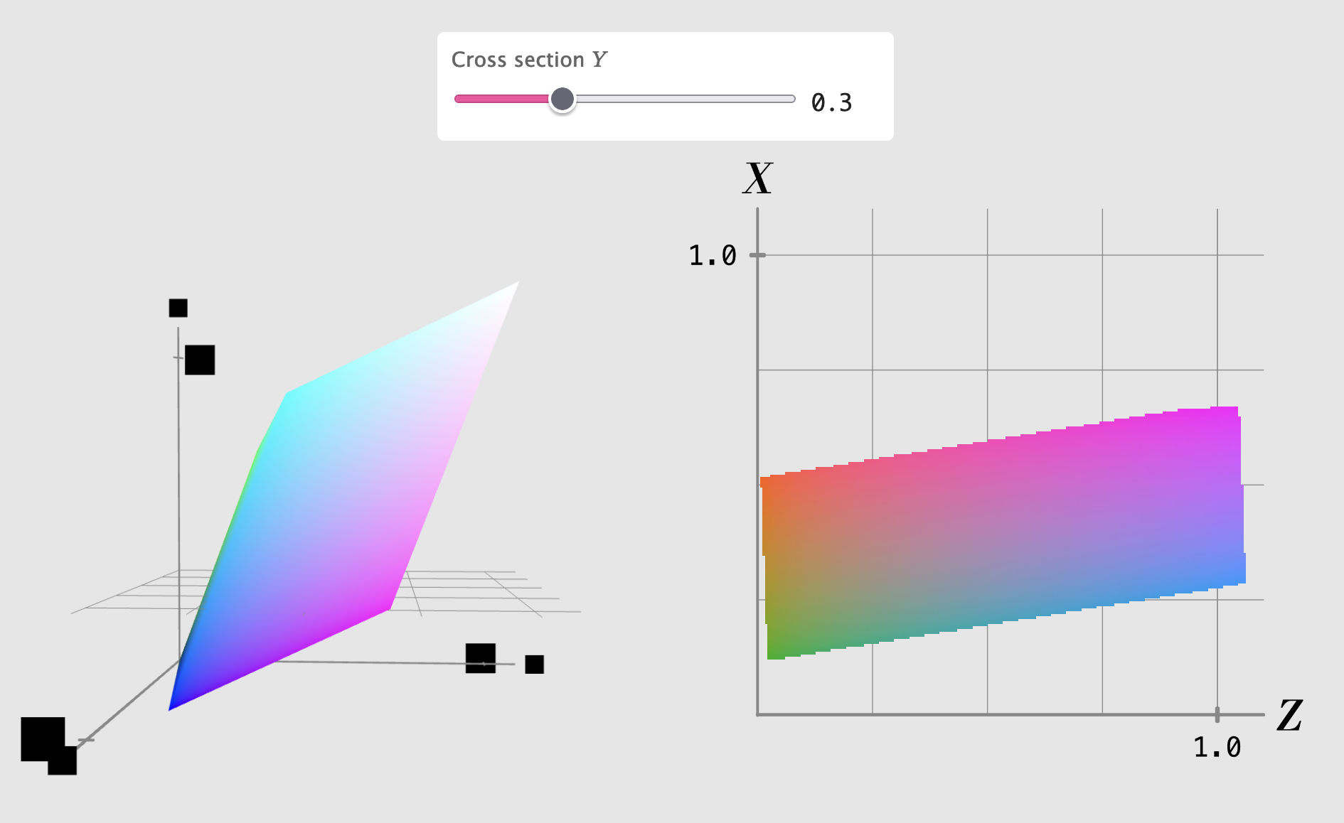
Lovely 3d interactive visualizations of color spaces, in this case with a responsive 2d slice of the color space displayed beside it
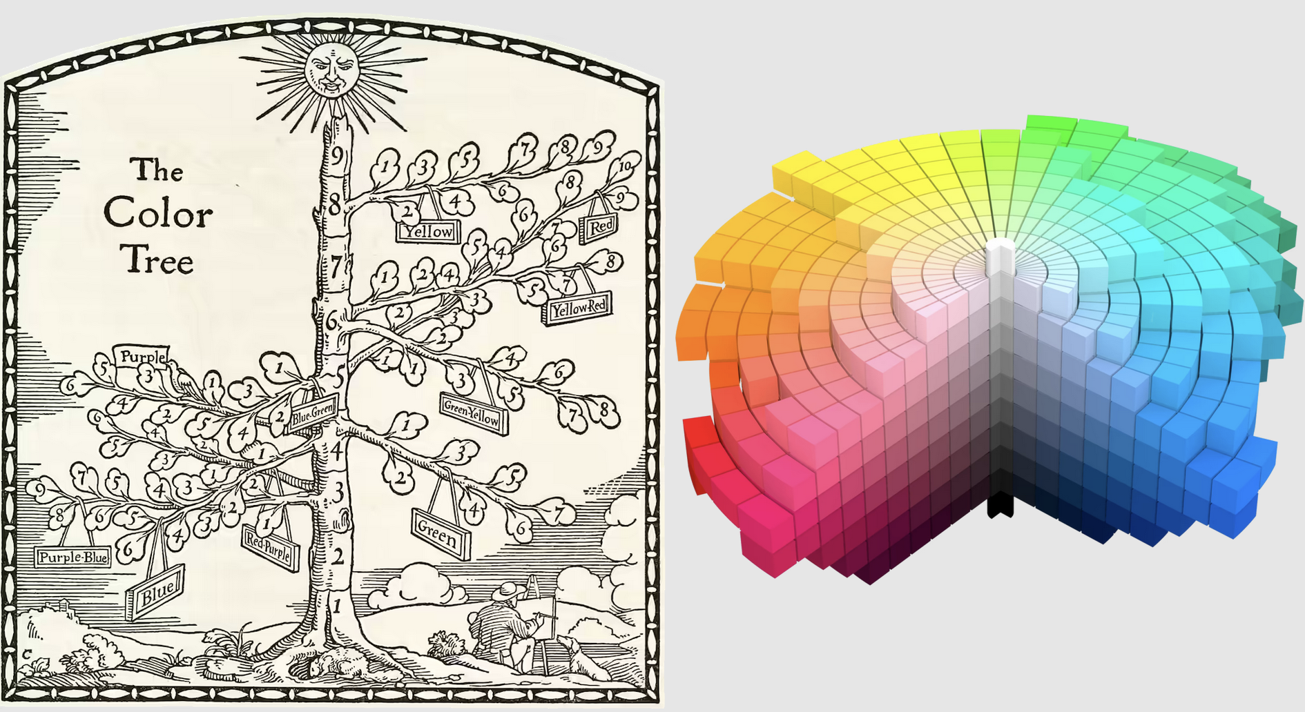
The first attempt at “it” (a perceptually-uniform color space) was made by Albert Munsell, who described his space in 1905 (charmingly, as a “COLOR TREE”) and published an “Atlas” to it in 1913.
The central “trunk” of Munsell’s TREE goes from black at the bottom, through grey in the middle, to white at the top. The middle expands outwards into a rainbow of “branches”, with each angle around the trunk representing a particular hue. Each branch starts off desaturated near the middle, and gets more and more saturated the further out it goes.
But – tragically! – CIELAB isn’t exactly perceptually uniform. Worse, the more experiments people did, the clearer it became that no three-dimensional space could ever be perceptually uniform; three dimensions just cannot capture all of the weird and wonderful ways that our eyes and brains process color comparisons.
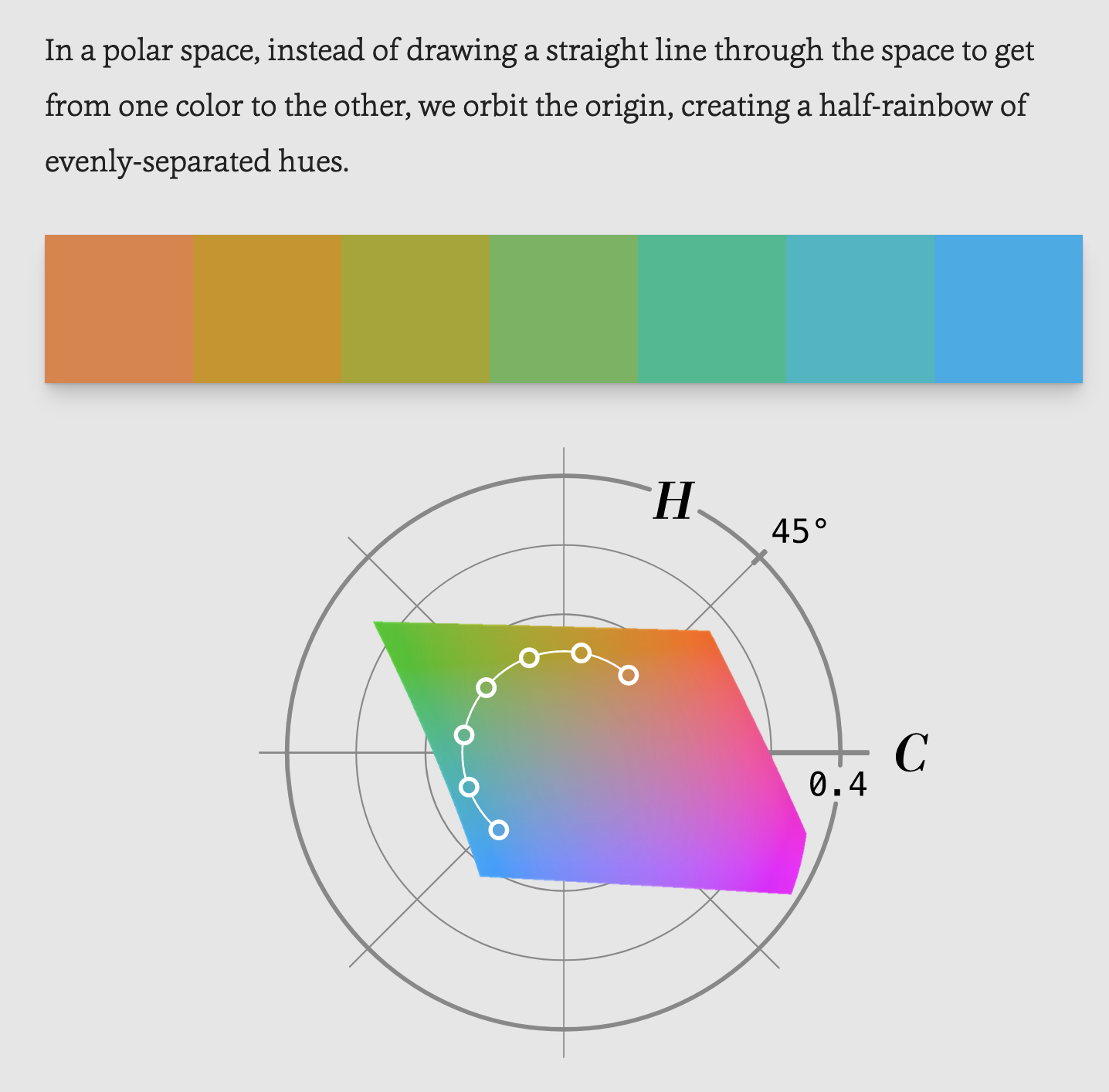
Thankfully – turns out! – Oklab was explicitly designed so that movement up/down, in/out, and around the L axis works exactly like navigating Munsell’s COLOR TREE. Each type of movement changes just one, psychologically-independent thing: the lightness, chroma, or hue of the color. In order to navigate Oklab like this, we need to use a polar coordinate system, instead of a rectangular one. When we do, we refer to the space by another name:
OKLCH


