A bar graph in the terminal with gnuplot
last updated: Oct 20, 2023
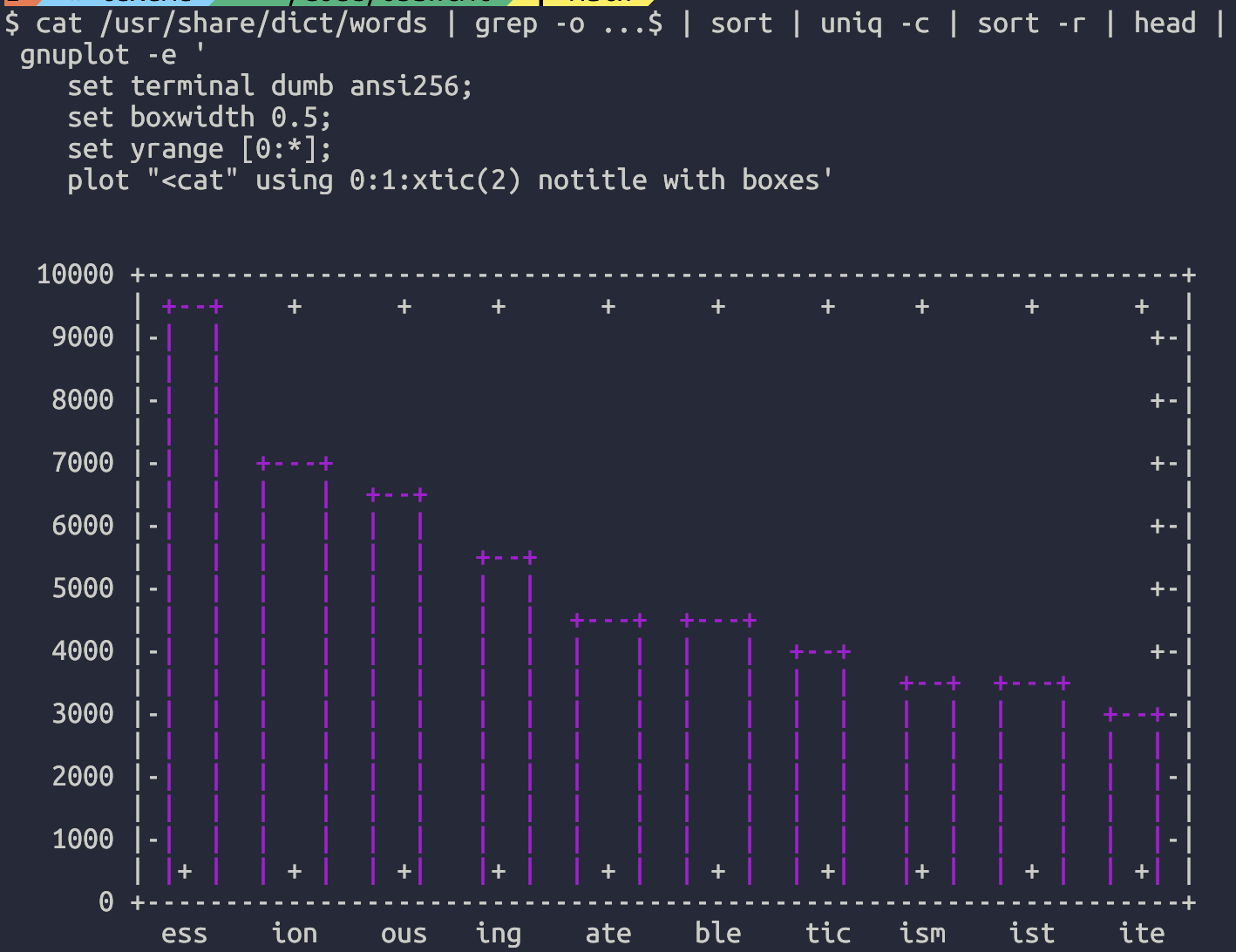
Here's a command that will give you the most common three-letter word endings in /usr/share/dict/words:
$ cat /usr/share/dict/words | grep -o ...$ | sort | uniq -c | sort -r | head
9271 ess
6916 ion
6421 ous
5539 ing
4561 ate
4351 ble
3996 tic
3485 ism
3286 ist
3061 ite
If you want to pipe that into gnuplot to get a bar chart at your terminal, you can use plot "<cat" to tell gnuplot to read from stdin, like so:
$ cat /usr/share/dict/words | grep -o ...$ | sort | uniq -c | sort -r | head |
 gnuplot -e '
    set terminal dumb ansi256;
    set boxwidth 0.5;
    set yrange [0:*];
    plot "<cat" using 0:1:xtic(2) notitle with boxes'


  10000 +------------------------------------------------------------------+
        | +--+    +      +     +      +      +      +     +      +      +  |
   9000 |-|  |                                                           +-|
        | |  |                                                             |
   8000 |-|  |                                                           +-|
        | |  |                                                             |
   7000 |-|  |  +---+                                                    +-|
        | |  |  |   |  +--+                                                |
   6000 |-|  |  |   |  |  |                                              +-|
        | |  |  |   |  |  |   +--+                                         |
   5000 |-|  |  |   |  |  |   |  |                                       +-|
        | |  |  |   |  |  |   |  |  +---+  +---+                           |
   4000 |-|  |  |   |  |  |   |  |  |   |  |   |  +--+                   +-|
        | |  |  |   |  |  |   |  |  |   |  |   |  |  |   +--+  +---+       |
   3000 |-|  |  |   |  |  |   |  |  |   |  |   |  |  |   |  |  |   |  +--+-|
        | |  |  |   |  |  |   |  |  |   |  |   |  |  |   |  |  |   |  |  | |
   2000 |-|  |  |   |  |  |   |  |  |   |  |   |  |  |   |  |  |   |  |  |-|
        | |  |  |   |  |  |   |  |  |   |  |   |  |  |   |  |  |   |  |  | |
   1000 |-|  |  |   |  |  |   |  |  |   |  |   |  |  |   |  |  |   |  |  |-|
        | |+ |  | + |  | +|   |+ |  | + |  | + |  | +|   |+ |  | + |  | +| |
      0 +------------------------------------------------------------------+
          ess    ion    ous   ing    ate    ble    tic   ism    ist    ite
It's not the most attractive graph in the world, but it might get the job done if you need something quickly.
The ansi256 in set terminal dumb ansi256 means that you can use colors to make it look somewhat better.
Here's what it looks like on my terminal:
Backlinks