demoscapes
last updated: May 26, 2026
Very cool interactive visualizations of a variety of statistics.
In this graph, the two dark blue smudges, with my mouse pointer on the second one, indicate excess male mortality in world wars I and II.
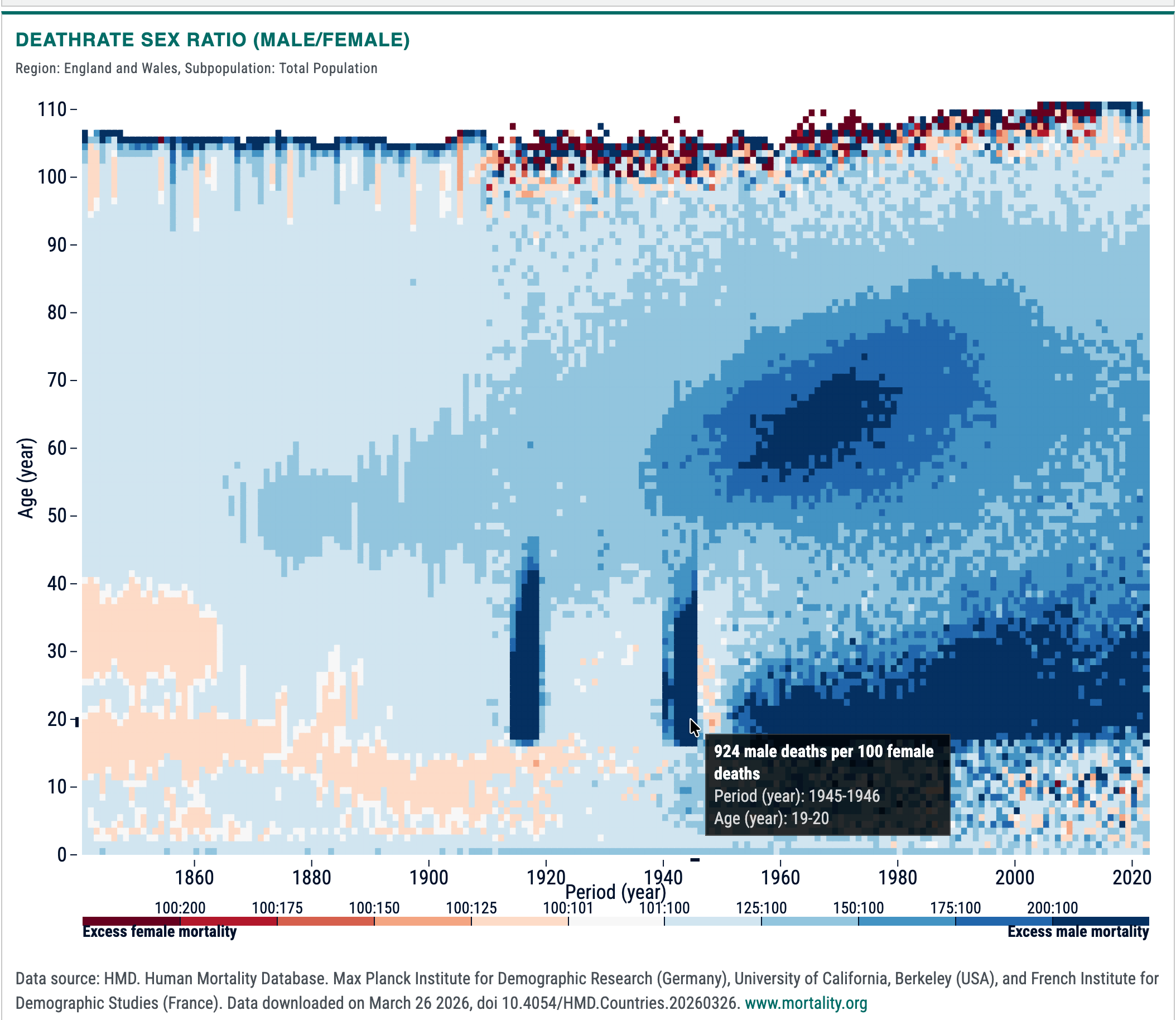
There are many more statistics available, and from many different countries' data.
via bsky, where Saloni Dattani provides this interesting annotated version