World map design for mobile
last updated: May 15, 2025
Really cool idea to design the projection on the left to replace the one on the right:
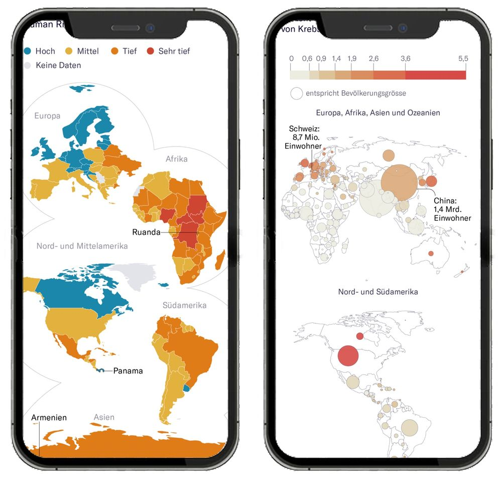
https://jonasoesch.ch/articles/thematic-worldmaps-on-mobile/ via bsky
Most world maps you see online are not really designed for mobile screens. They're too small and require interaction to see countries like Switzerland. At NZZ, we wondered if we could come up with a design that works better. In a large user study, we showed that our redesigned world map improves readability – especially for small countries. We also found that using bubbles sized according to population, rather than land area, led to interpretations that more accurately reflected the underlying data.