line graph in the terminal with gnuplot
Jan 29, 2024
I wrote a command that outputs data in tabular format, looking like this:
$ rb services metrics app-prod | head
time                 memory       cpu
2024-01-29T07:19:00Z 191668346880 39688
2024-01-29T07:20:00Z 191886577664 39953
2024-01-29T07:21:00Z 191411822592 38933
2024-01-29T07:22:00Z 190887628800 38824
2024-01-29T07:23:00Z 192347156480 39501
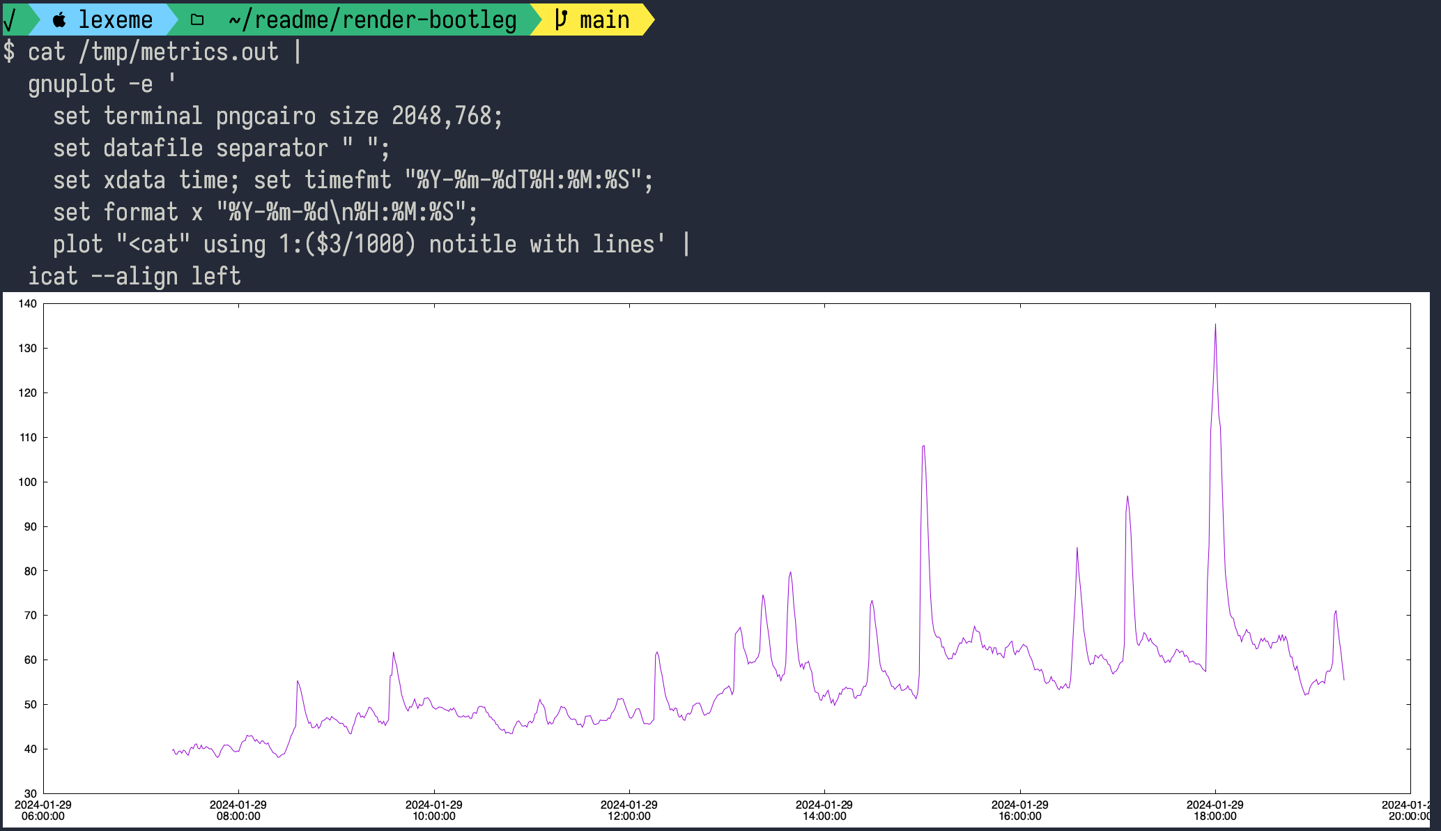
I wanted to print the CPU column to the terminal with a nice line graph. Here's where I ended up:
rb services metrics app-prod |
  gnuplot -e '
    set terminal pngcairo size 2048,768;
    set datafile separator " ";
    set xdata time; set timefmt "%Y-%m-%dT%H:%M:%S";
    set format x "%Y-%m-%d\n%H:%M:%S";
    plot "<cat" using 1:($3/1000) notitle with lines' |
  icat --align left
and here's what it looks like: